False Color Landsat Wall Prints

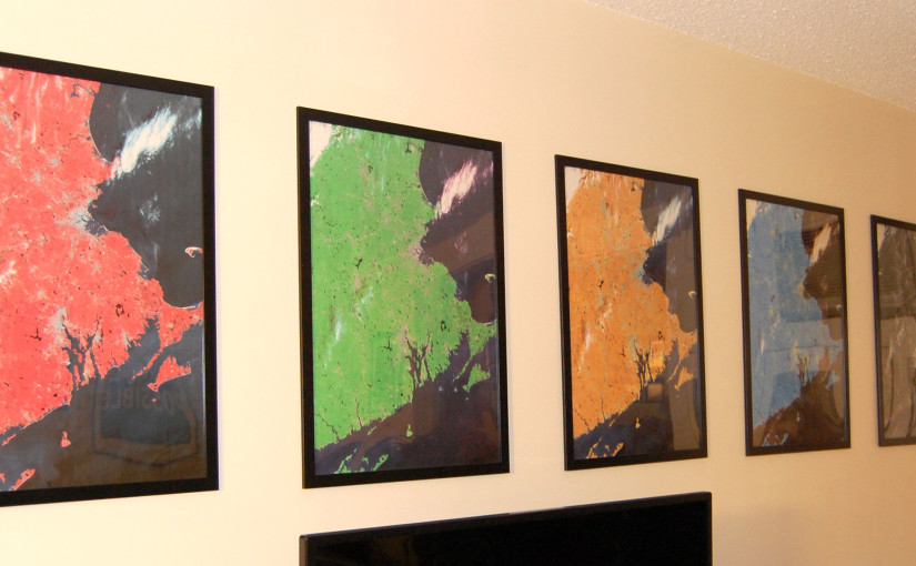
When I moved into my apartment in fall 2013, the long wall behind the TV desperately needed some decorations. While playing around with band combinations in some Landsat imagery at work, I stumbled upon an idea: a series of prints of multispectral remote sensing imagery with different band combinations. The series would resemble Warhol’s multicolored Marilyn Monroe prints, except that the striking color palettes would represent actual band combinations used in the remote sensing field to highlight different surface characteristics.

The prints depict a mostly cloud-free view of eastern Massachusetts, Rhode Island, southern New Hampshire, eastern Connecticut, and the tip of Long Island. The prints lack the usual accoutrements of maps like state outlines, legends, north arrows, and scale bars. For this reason, it takes many visitors a minute to realize they are maps and not some kind of abstract print.

All five fit nicely behind the TV
Another view
Another view
Detail. The frame on the left is one inch across

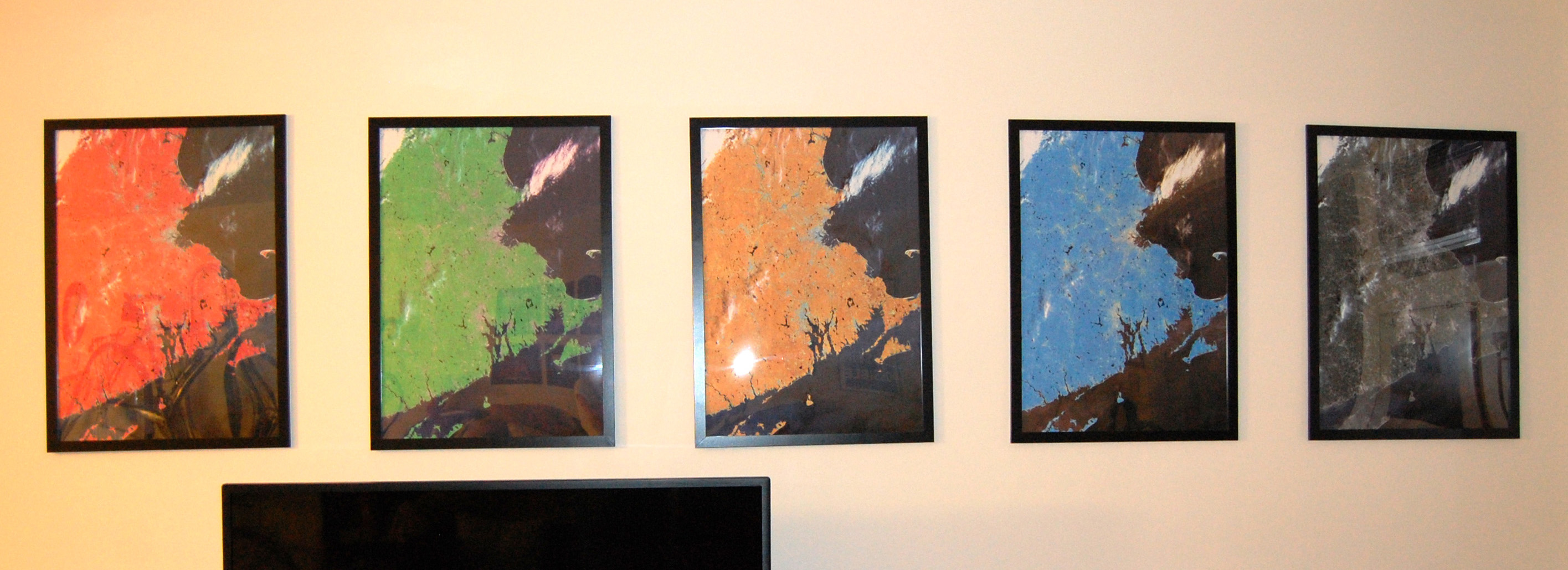
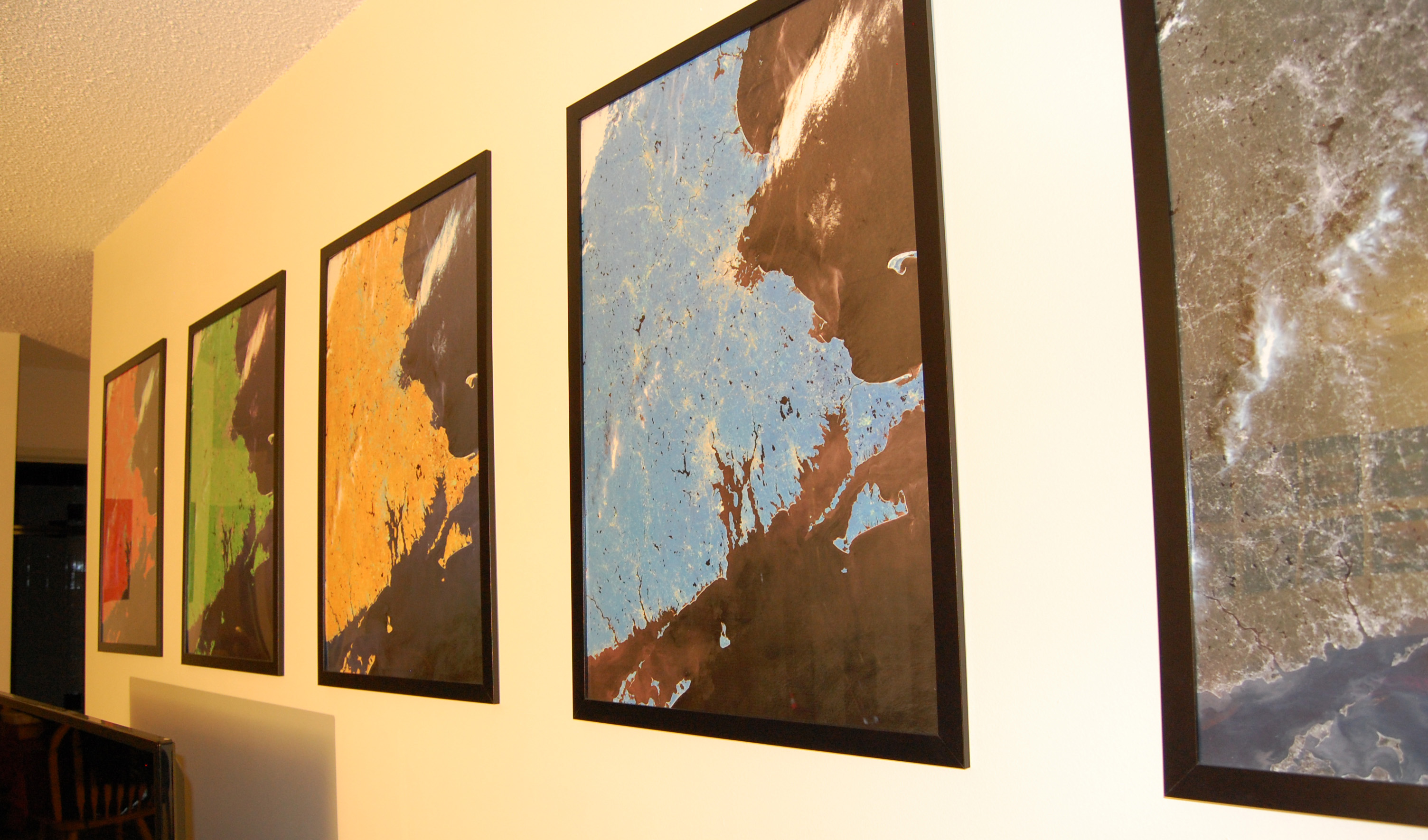
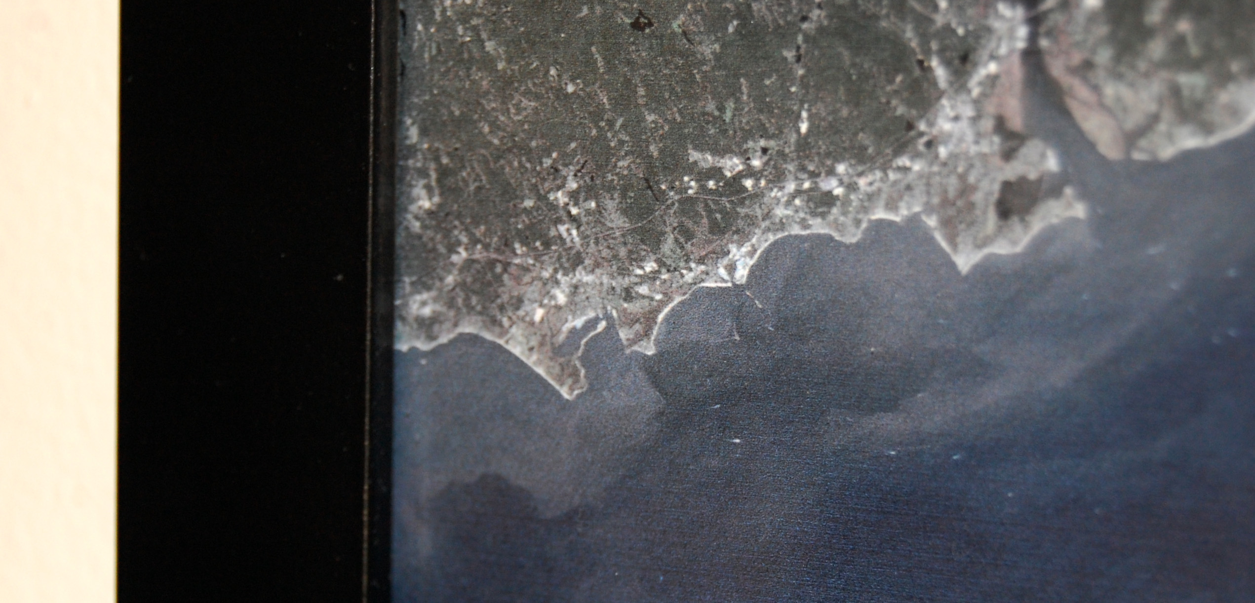
I made these prints in ArcGIS using two scenes from the Operational Land Imager (OLI) onboard the $850 million Landsat 8 satellite. The publicly available LC80120302013250LGN00 and LC80120312013250LGN00 scenes were captured sequentially as Landsat 8 passed over from northeast to southwest at 11:30am EDT on Saturday, September 7, 2013. The tilt of the prints occurs because Landsat 8 orbits at a slight angle from due north so it can pass over different parts of the Earth. Luckily, rows 30 and 31 in path 12 of the Landsat Worldwide Reference System include almost all of eastern Massachusetts; only Nantucket and part of Cape Cod are missing.

Continue reading False Color Landsat Wall Prints

NASA Earth Observatory Puzzler

I’m big fan of the NASA Earth Observatory website run by the Goddard Space Flight Center. Their Image of the Day series showcases stunning imagery and applications of remote sensing every day, in the style of the long-running Astronomy Picture of the Day. They also hold a monthly “puzzler” competition, where they post a satellite image without any annotations and ask readers to identify the location and why it’s interesting. For the December puzzler, they posted the following image:

NASA Earth Observatory December 2014 puzzler image

The scene depicts a valley in a cold climate, with some kind of body of water (or other liquid?) at center. The sinuous shape suggests glacial activity, though this conflicts with the lack of snow and ice. Notably, no vegetation is visible anywhere, making it look very similar to a HiRISE image of Mars. I then thought that this could be the McMurdo Dry Valleys in Antarctica. In college, I saw a number of presentations from professors and graduate students who had conducted research in the Dry Valleys because of the similarities to Martian climate. After only a few minutes of hunting around on Google Maps, I found the location. But what was in the center of the image that looked like a lake?

The Wikipedia page for the McMurdo Dry Valleys lists a number of lakes. I clicked on the link for Don Juan Pond, which was noted to be the most saline of all, and bingo: the image was a perfect match. I quickly wrote up a description and submitted it in the comments section. Lo and behold, I was the first commenter and won the puzzler!

As it turned out, the research paper that inspired the puzzler was coauthored by Brown researchers Jay Dickson and Jim Head. Perhaps it was the memory of one of their presentations that made me think of the Dry Valleys. Either way, what a small world.

USGS HydroSHEDS 5 Degree Tile Index Map

I frequently use the HydroSHEDS dataset from the USGS for projects requiring a DEM outside of the United States. HydroSHEDS is a contrived acronym for Hydrological data and maps based on SHuttle Elevation Derivatives at multiple Scales, meaning the digital elevation model comes from the Shuttle Radar Topography Mission (SRTM). SRTM mounted an InSAR array on Space Shuttle Endeavour during STS-99 in 2000 to collect elevation data from latitudes 56°S to 60°N. Although SRTM has less global coverage and less spatial resolution than the ASTER GDEM, SRTM has better vertical accuracy, making it more attractive for hydrologic applications like HydroSHEDS.

The 90 meter (or 3 arc second) gridded data products from HydroSHEDS are distributed in tiles that are 5 degrees by 5 degrees in size. This includes a void-filled DEM, a hydrologically conditioned DEM, and a flow direction grid. For reasons unknown, there is no index map of the 5 degree tiles available on the USGS website. Since it’s difficult to determine exactly which tiles fall in a given extent, I decided to make the map I needed:

HydroSHEDS 5 degree index map (click for full size, 935K PNG)

Each tile in this map is labeled with the concatenated tile name representing the coordinates of the lower-left corner of each tile. For example, the tile for Rhode Island is “n40w075” with a lower left corner at 40°N latitude and 75°W longitude.

The fact that the tiles are measured in degrees means that this is an excellent case for using the plate carrée equirectangular projection, which has horizontal and vertical units of degrees. This is, of course, equivalent to what ArcMap shows when setting a data frame’s coordinate system to a “geographic” projection.

For convenience, you can also download the index in shapefile or GeoJSON format.