Feedly is my preferred RSS reader/aggregator since the demise of the late Google Reader in 2013. It has an attractive interface, straightforward means to add new feeds, and keyboard shortcuts for power with dozens of feeds and hundreds of articles per day. There are also some sharing, searching, and discovery features under their subscription plan with which I am not familiar.
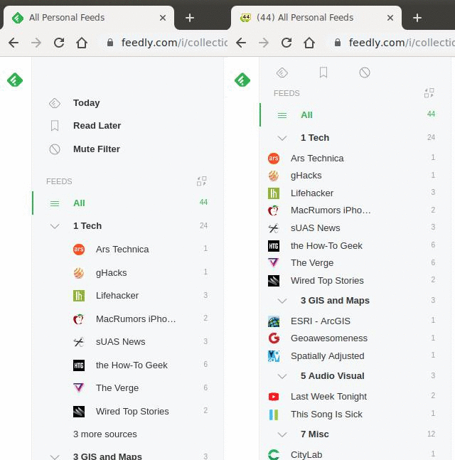
A few weeks ago, Feedly rolled out a shiny new UI which I liked, by and large. However, there’s way too much whitespace on the left navigation bar for my taste, and even the “Compact” display density setting (under “Appearance”) is not sufficient. Userscripts to the rescue!

Userscripts are typically small snippets of JavaScript that can modify the appearance of a webpage, injected via a browser extension like Tampermonkey. I just updated my Github repo with two userscripts (originally copied from the now-dead userscripts.org site):
feedly-enhancer-chrome.js, originally byneword, injects some CSS to reduce the amount of whitespace in the sidebar and main area.feedly-unread-favicon.js, originally byMatthew Wilkin, changes the favicon to display a tiny counter of the number of unread stories.
The gif above shows a quick before-and-after. Feedly looks a lot better and is a lot more useful with the userscripts enabled.