This spring I designed two posters for on-campus events at Brown. Though I’m still figuring things out as I go in Photoshop and InDesign, they both came out quite nicely.
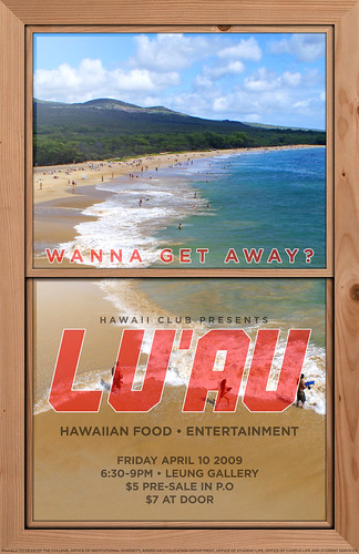
Lu’au
Chris asked me if I had any ideas for a cool poster to promote the Lu’au he was planning with the Hawaii Club. While brainstorming ideas, I thought of how much better the weather in Hawaii was compared to Rhode Island in February. That gave me the idea to create a trompe-l’œil window with a view of a Hawaiian beach, teasing the viewers’ plight while the slogan (shamelessly borrowed from Southwest Airlines) “Wanna get away?” encourages them to come. I found a suitable background photo, some good hi-quality wood textures for the window, and set to work. The final product was composed in Photoshop as a 300dpi 11″x17″ poster, set in Gotham and Commando.
¡Exótica!
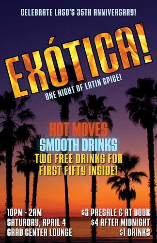
Matt and Roxy had asked me to DJ the Latino American Students Organization’s party in April. While planning for the event, I volunteered to draft a promo poster to replace the one Matt threw together in Microsoft Word. I used his layout, but used poster-quality images and textures that would be suitable for 11×17 printing. I compsoed the end result in InDesign and set the text in House Gothic 23 Bold Condensed 4.
