This was my final paper for HIAA0850: Modern Architecture. Our prompt was to pick an architect, building type, singular building, building material, or building technique. I chose the Class of 1945 Library at Phillips Exeter. As an Exeter student, I had known that the library was architecturally significant. I was glad that I had the opportunity to learn why it was significant in HIAA85.
Louis Kahn’s Exeter Library: A Reinterpretation of the Ideal Reading Space
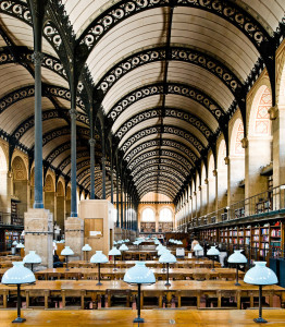
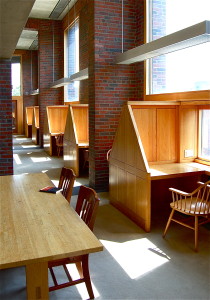
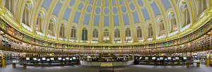
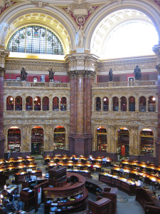
Louis Kahn’s Exeter Library (1969-1971) masterfully upends the traditional layout of libraries. At the time, most well-regarded libraries encircled a single, grand, high-ceilinged reading room with many individual floors of bookshelves (Figure 1). While the communal reading room impressed and awed the scholar by demonstrating the immense quantity of accumulated knowledge available to them, this design conflicted with Kahn’s vision of the ideal reading spot. Instead of a single, grandiose, reading room, Kahn pictured smaller, more private, and more intimate spaces next to outside windows: carrel desks. To integrate this vision into the Exeter Library, Kahn surrounded the traditional atrium and ring of bookshelves with another outer ring of carrels and tables next to large windows (Figure 1), keeping students close to the sun’s illuminating glow and books away from its damaging rays. Through this innovation and many others, Louis Kahn’s meticulous and thoughtful design of the Exeter Library earned the building the Twenty-Five Year Award from the American Institute of Architects. The Exeter Library is truly a hidden gem among Kahn’s monumental, modernist jewels.
I: Louis Kahn
Louis Kahn’s rise to architectural renown is a classic rags-to-riches tale. Kahn immigrated to Philadelphia from Estonia with his family in 1906. As a young child, light fascinated Kahn, perhaps a byproduct of his father’s occupation as a glassmaker. But at the age of three, tragedy struck: Kahn accidentally burned his face and hands with the glowing coals of the family’s stove, scarring him for life. His parents, who were already struggling to make ends meet, worried that he would never succeed with such visible imperfections.
As a child, Kahn showed a talent for drawing and received a scholarship to Philadelphia’s Public Industrial Art School where he further developed his abilities in music and fine art. After winning many awards for his exquisite watercolors, the Pennsylvania Academy of Fine Arts offered him a four-year scholarship. Kahn surprisingly declined this offer after taking a life-changing class in architectural history. He decided to pursue architecture at the University of Pennsylvania, the most renowned architecture school at the time.
Penn’s architecture program prided itself on teaching students in an adaptation of the French system at the famous École des Beaux-Arts in Paris. Kahn learned architecture through a traditional, historicist lens, taught by masters including Paul Philippe Cret, who had designed many municipal buildings in Philadelphia and Washington, D.C. Kahn graduated in 1924 with the reputation of being one of the best draftsman from one of the best architectural schools in the country. But the architecture world was undergoing a major shift, in which training Beaux-Arts fell from grace.
The surge of modernism from Europe in the 1920s challenged the prevailing historicism in the United States. Le Corbusier’s published his influential manifesto Vers une architecture in 1923, just before Kahn graduated from Penn. Over the next few years Kahn worked as a draftsman with mediocre success at a few different firms designing traditional municipal buildings, as well as some of the structures at Philadelphia’s Sesquicentennial Exposition in 1926. With the start of the Great Depression in 1929, the focus for many architects shifted towards creating clean, safe, and elegant housing at low cost for the millions now destitute worldwide. With a small team, Kahn designed a few efficient if unremarkable housing projects for various competitions, making just enough to get by throughout the Depression and World War II.
In 1947, he received an invitation to teach at Yale, which he quickly accepted. Well-regarded by students, the now fifty-year-old Kahn became popular enough that he received his first major commission for the new Yale University Art Gallery in 1951, despite his short résumé of major projects. The result was a masterpiece (see Figure 2). Kahn’s design carefully considered the effects of sunlight and noise, incorporated a unique and clever tetrahedral molding pattern for the ceiling, and clustered the mechanical equipment for the entire building in a single columnar zone. Kahn quickly rose from the position of an obscure professor to an architectural celebrity.
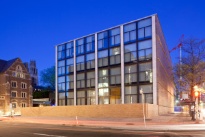
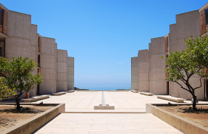
Kahn’s next large project came from Jonas Salk, the clinical researcher who discovered the polio vaccine. The laboratories and offices of the Salk Institute were to be located on a bluff overlooking the Pacific in the San Diego suburb of La Jolla. Kahn’s elegant design echoed a Greek temple overlooking the Mediterranean, though he replaced Grecian marble with poured concrete visually softened by areas of teak paneling (see Figure 3). Kahn further developed his understanding about the subtle interplay of light reflected off of different surfaces, and how it interacts with large and small spaces. He also employed an innovative design that devoted entire stories to mechanical space (the so-called “servant spaces”) separate from the laboratories (the so-called “served spaces”) which could then be completely open and rearranged as needed.
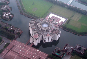
By the time construction was underway on the Salk Institute, Kahn had achieved an international reputation that landed him the largest and grandest project of his career: the National Assembly Building in Dhaka, Bangladesh (see Figure 4). Kahn’s bold 800,000 square foot design for the parliament looks like an indoor city with hundreds of stairwells, courtyards, and skylights crisscrossing the interior. Exaggerated geometric cutouts in the exterior façade give the building a unique and instantly recognizable appearance, while strategically maximizing cross-ventilation. Despite a lack of skilled laborers and incessant delays, the Assembly Building is beloved by Bangladeshis and architectural scholars worldwide.
II: Planning
By the later part of his career, Kahn’s commission to design the new library at Phillips Exeter Academy in 1965 contrasted with his other projects. Compared to the Salk Institute’s large campus and the enormous National Assembly Building, a nine story library in New Hampshire was a small, perhaps boutique project. A commission for an elite, private, preparatory school also contrasted with the more society-focused and humanitarian uses of his structures in La Jolla and Dhaka. But after meeting with the sponsors of the project and learning about Exeter, Kahn embraced the project and executed one of his most “complex and successful buildings.” (Wiseman 2007, p. 180)
Since its founding in 1781, Phillips Exeter Academy was consistently ranked as one of the top secondary schools in the United States. In the schools charter, founder John Phillips emphasized that:
“Above all, it is expected that the attention of the instructors to the disposition of the minds and the morals of the youth under their charge will exceed every other care; well considering that though goodness without knowledge is weak and feeble, yet knowledge without goodness is dangerous, and that both united form the noblest of character, and lay the surest foundation of usefulness to mankind.” (Phillips)
This philosophical interpretation of the role of teaching appealed to Kahn, who approached each of his commissions by discovering the fundamental spiritual idea that would drive the design process—one of Kahn’s contemporaries fittingly labeled him as “a philosopher among architects.” (Torres 2000, p. 136.)
Moreover, the relationship described between goodness and knowledge in teaching bears resemblance to the longstanding tension between form and function in architecture. As Exeter strived to unite goodness and knowledge, Kahn would strive to unite form and function in his design of the Academy’s library.
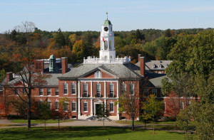
The decision to offer the commission to Kahn was not an easy one. Most of the buildings on the Exeter campus embraced a traditional Georgian-style of red brick exteriors with white trim, many of which were designed in the earlier part of the century by the prolific historicist architect Ralph Adams Cram (see Figure 5). When the need for a new library first arose in the mid-1950s, a traditional design was drawn up by a reputable firm that satisfactorily fulfilled the requirements. After many years of planning, Exeter’s forward-thinking principal scrapped the bland plans, fired the architects, and tasked the head librarian and a small committee with finding the “outstanding contemporary architect in the world” for the project. This was no easy request. The newly completed first “modern” building on campus—a flat-roofed International style concrete dormitory—was derided by students and faculty alike, described as “a Howard Johnson motel that had lost its way.” (Armstrong 2004) The architect the committee was to select must incorporate the desired modern features while respecting the surrounding campus and the materials that defined its architectural character.
The committee considered many prominent modern architects, including Philip Johnson, I.M. Pei, Edward Barnes, Paul Rudolph, and Louis Kahn. In meetings around the country, every firm expressed their desire for the commission. Although Kahn intrigued the committee, the kicker was a phone call from Jonas Salk himself. Salk’s eldest son graduated Exeter in 1961, and upon hearing about the search, insisted that the committee visit the Salk Institute in La Jolla. After being personally toured around the breathtaking facility by Salk, they were convinced. Kahn received the commission in November 1965. (Armstrong 2004)
The committee submitted an unusually lengthy and comprehensive design plan to Kahn. In it, they expressed not only the physical and facility requirements for the library, but also the philosophy they hoped the building would embody and the atmosphere it would convey:
“No longer a mere depository of books and magazines, the modern library becomes a laboratory for research and experimentation, a quiet retreat for study, reading and reflection, the intellectual center of the community.… Fulfilling needs of a school expected eventually to number one thousand students, unpretentious, though in a handsome, inviting contemporary style, such a library would affirm the regard at the Academy for the work of the mind and the hands of man… The emphasis should not be on housing books but on housing readers using books. It is therefore desirable to seek an environment that would encourage and ensure the pleasure of reading and study.” (Wiseman 2007, p. 187)
This philosophical notion of a library as a “quiet retreat” resonated with Kahn. Ten years earlier, in a submission for a design competition for a college library, he realized that the central reading room that dominated the plans of most libraries conflicted with the act of reading:
“A man with a book goes to the light. A library begins that way. He will not go fifty feet to the electric light. The carrel is the niche which could be the beginning of the space order and its structure.” (McCarter 2005, p. 305)
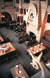
This contrasted with the libraries he had been taught to celebrate under his Beaux-Arts training, like the Bibliothèque Sainte-Geneviève in Paris (Figure 1), the British Museum Reading Room in London, the Jefferson building at the Library of Congress, and even the Furness Library at the University of Pennsylvania where Kahn’s teaching office was located (Figure 6). Nevertheless, Kahn went forward with his inverted design that replaced the central reading room with a periphery of carrels.
III: Exterior
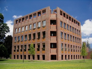
The final design of the Exeter Library consisted of a nine-story brick cube, 111 feet on each side and 85 feet tall (Figure 7). A grid of recessed window openings eight wide and five tall pierce each of the cube’s faces. The middle three rows of openings were double-height, with a recessed window above and a teak panel below. Inside, each of these double-height openings illuminated one floor and its overhanging mezzanine floor, though this is not apparent from the outside, giving the building the appearance from a distance of only having five floors. Kahn chamfered (or beveled) the corners of the overall cube but understated the corners by setting the bevel inside the rectangular faces of the adjoining sides.
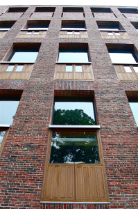
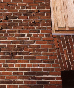
Close inspection of an individual set of stacked openings on the outside reveals a subtle nod to the load-bearing functionality of the brick exterior (Figure 8). Going upwards, each opening is exactly one brick width wider than the opening at the level below; conversely, each brick pier is exactly one brick width narrower than at the level below, demonstrating the decreasing load borne by the façade higher up. Kahn remarked on this design, saying “The weight of the brick makes it dance like a fairy above and groan below.” (Huxtable 1972) Kahn employed a similar tapering in the columns earlier at the Indian Institute of Management and later at the Yale Center for British Art. Trapezoidal jack arches of vertically laid bricks separate each opening (Figure 9), letting the change in width flow seamlessly in the vertical dimension.
The bricks used in the exterior came from a local brickyard that had supplied many other collegiate building projects, especially at Harvard. Sadly, the brickyard had come under hard times during the library’s planning process and was bankrupt. Before debt collectors could seize its assets, Kahn rushed to New Hampshire and convinced Exeter to purchase two million bricks for the library well before the plan was finalized. He “thought the bricks were marvelous” for their dark, rich, red color and frequent irregularities. (Figure 9). The miscut bricks stand out further—especially when casting a shadow—in the context of the otherwise flawlessly flat faces of the cube, creating an interesting dialog between the smoothness of the building’s shape and the roughness of the material.
The lowest row of openings at sidewalk level lacked windows, opening instead onto an inset arcade that circled around the structure to the front entrances hidden behind the brick columns on the building’s north face (Figure 10). This lack of an easily identifiable front entrance is one of the main criticisms of the exterior. But by drawing attention to such an entryway, Kahn would have compromised the structure’s elegant cubic geometry that kept all four faces identical, in turn implying that one face (the “front”) was more important or preferred over others. Since lawns surround the building (Figure 7) and students heading to the library would be walking from all directions, such an imbalance would have been unsuitably uninviting from some angles by implying they were approaching from an improper direction. Photographers in the intervening decades have subconsciously attested to this justification: photos of the exterior are taken from all different sides and not just from the actual “front” on the north side of the building. Kahn argued that the circumscribing arcade had an additional functional motive: “If you are scurrying in rain to get to the building, you can come in at any point and find your entrance.” (Kahn 1986, p. 178)
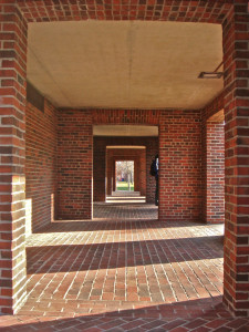
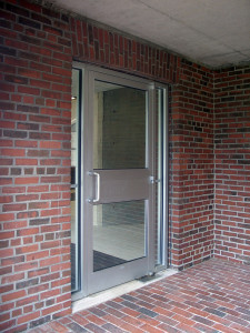
The exterior of the Exeter Library looks modern compared to nearby buildings. The strictly cubic design and unadorned façade contrasted with the oblong proportions and white trim of the Georgian-style buildings that typified the Exeter campus. However, Kahn’s use of a soulful, rough, deep red colored brick and warm teak paneling softened the contrast. The library’s style seems like the natural next step from the campus’ prevailing style—a modern structure that highlights its similarities to its neighbors and not its differences. The interior, however, breaks strongly from tradition.
IV: Interior
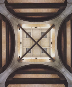
Upon entering the library through the “hidden” doorway, the rough red brick of the arcade makes way for a polished travertine double staircase that spirals upward to the main floor. Ascending the limestone steps, the low-ceilinged entranceway dramatically opens up to the stunning eight-story atrium, “exploding with spatial and tectonic excitement,” (Wiseman 2007 p. 194) (Figure 11). Oversize pillars in each corner immediately draw the eyes upwards to the enormous circular cutouts piercing the concrete shell of the cathedral-like atrium, revealing five teak-paneled floors of bookshelves on all four sides. The concrete supporting walls of the atrium and the floors of bookshelves never visibly touch (Figure 12), such that the floors appear to float effortlessly in the recessed space behind the circular cutouts. At the top of the atrium, a massive, exaggerated cruciform cross-brace connects the corners of the atrium and diffuses light downwards from the clerestory windows, the light and weight of the building seeming to flow from top to bottom (Figure 12).
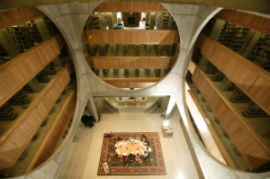
This sensational symphony of volumes, shapes, and light inspire the same awe felt after entering more traditional libraries like the Bibliothèque Sainte-Geneviève (Figure 1) or the British Museum Reading Room (Figure 6). But conspicuously absent are the expected rows of desks and tables—the atrium floor at the Exeter Library is bare except for one meeting table. As Kahn had realized, the most impressive space in the building was not necessarily the best place to study. In an interview, Kahn had said, “I’m not sure the large reading room means very much anymore because it is only a place where boy meets girl and nobody reads.” (Kahn 1986, p. 180) One must travel upstairs to reach the study areas.
The library’s functional genius is revealed in these middle floors (Figure 13). A ring of walkways and bookshelves surround the atrium, what Kahn called a “concrete doughnut where the books are stored away from the sunlight.” (Kahn 1972) Outside of this ring was a “brick doughnut” of carrels and small tables, placed at the very edge of the building near the large windows. This inverted design embodied the “quiet retreat for study” that Kahn sought. He said, “I felt the reading room would be where a person is alone near a window, and I felt that would be a private carrel, a kind of discovered place in the folds of construction.” (Kahn 1972)
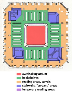
In total, the Exeter Library contained four floors of carrels. Kahn organized these as two pairs of floors, corresponding to the third and fourth openings in the exterior faces of the structure. Each pair had one base floor with a double-height ceiling, and one mezzanine floor overlooking the base floor below (Figure 14). Since the carrels on the lower floor sat directly next to the windows, Kahn included a clever sliding shutter so that a student could block out the glare of direct sunlight and read using diffuse reflected light that entered through the larger window above. The carrels on the upper floor needed no such shutter since they sat farther away from the windows.
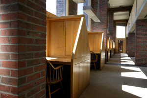
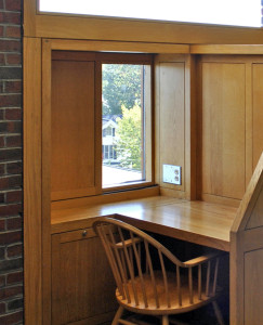
Kahn’s meticulous level of consideration to the reading areas’ illumination indicates his deep-seated respect for scholarship and the act of reading. His inverted design would still have been innovative even if he eliminated the double-height reading area, extended the mezzanine to the wall and failed to include shutters for the sun. But the final plan went further than merely reinterpreting the ordering of spaces in a library—he foresaw the play of light and deftly envisioned a design that would utilize it to complement the sacred rite of reading.
The transplantation of the traditional single reading room to the periphery of the library left the atrium’s floor nearly empty. If the atrium wasn’t intended to be occupied, wasn’t its inclusion arguably decorative and gratuitous? The answer is no—for two reasons. First, the open atrium offers unobstructed line-of-sight visibility between most areas in the library (Figure 15). This let students see which of their classmates were moving around the bookshelves across the way, or on another floor. In this way, the atrium becomes a focal point of the community itself, a “town square” or “piazza”, instead of merely the focal point for their studies. Kahn said, “The interior chamber was to be used for entering, and being in a place from which all essential services can be felt: the catalogues, the reference rooms, and the service desk.” (Kahn 1986 p. 180) Second, the open atrium and the clerestory light reflected by the ceiling’s cross-beams diffused natural light downwards to the bookshelves (though never enough to damage the volumes themselves). Kahn placed an inclined reading shelf at the edge of the balconies (Figure 15). A student looking through different texts in the bookshelves now had a naturally-lit temporary place to flip through a book before deciding whether or not to borrow it at the circulation desk or bring it back to their carrel. This is much more comfortable than the usual practice of sitting on a stepstool in a cramped aisle or fumbling to flip through a book while standing.
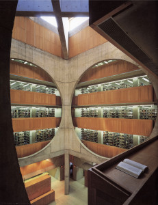
Kahn’s design of the interior of the Exeter Library was genius. The unusual placement of the reading areas around the periphery of the building offered a more comfortable, more private, and better-lit place for students to study. The grand atrium and the circular cutouts into the floors of bookshelves offered unobstructed views between most points in the build. And the brick “doughnut” of bookshelves between the study areas and the atrium protected the books from the sun. Kahn’s Exeter Library more-than fulfilled the commission, which had specified a space that felt “unpretentious, though in a handsome, inviting contemporary style…that would encourage and ensure the pleasure of reading and study.”
V: Conclusions
As a student at Exeter for four years, I had heard snippets about the famous architect who designed the library. The steady stream of camera-laden architecture buffs I saw in and around the building attested to its significance—whatever that was. I’ll admit that even after four years, I had never really noticed how oddly empty the atrium was, or how the building consisted two concentric “doughnuts” of concrete and brick, or how different the layout was compared to most libraries, or even that the brick columns in the exterior façade tapered at all. But in a subconscious sort of way, I could feel the mastery of the design through my use of the building. It was a pleasure to study in, a comfortable place to conduct research, and a warm space to meet with friends and classmates. The building just worked.
In a speech at Exeter after the building’s completion, Kahn said, “If you were given the first commission before libraries were ever built to build a place where these books can be, what would you do? That is the thought you have about its nature when you are given the privilege of designing a building.” Kahn’s philosophical design process produced a library with a uniquely functional layout, a spectacular central atrium, and a handsome brick exterior. His Exeter Library truly united form and function to make it a hidden gem among his monumental, modernist jewels.
Bibliography
- Armstrong, Rodney. “Lou Who?.” The Exeter Bulletin, 2004.
- Brownlee, David Bruce. Louis I. Kahn: In the Realm of Architecture. Los Angeles: Museum of Contemporary Art, 1991.
- Gast, Klaus-Peter. Louis I. Kahn: The Idea of Order. Basel: Birkhäuser Verlag, 1998.
- Gast, Klaus-Peter, and Louis I. Kahn. Louis I. Kahn: das Gesamtwerk. Deutsche Verlags-Anstalt, 2001.
- Huxtable, Ada Louise. “New Exeter Library: Stunning Paean to Books.” The New York Times, October 23, 1972.
- Kahn, Louis. “The Mind of Louis I. Kahn.” The Architectural Forum, July 1972.
- Kahn, Louis I, University of Pennsylvania, and Pennsylvania Historical and Museum Commission. The Louis I. Kahn Archive: Personal Drawings: The Completely Illustrated Catalogue of the Drawings in the Louis I. Kahn Collection, University of Pennsylvania and Pennsylvania Historical and Museum Commission. Garland architectural archives. New York: Garland, 1987.
- Kahn, Louis I, and Richard Saul Wurman. What Will Be Has Always Been: The Words of Louis I. Kahn. New York: Access Press, 1986.
- Lobell, John. Between Silence and Light: Spirit in the Architecture ofLouis I. Kahn. Boulder: Shambhala : distributed in the U.S. by Random House, 1979.
- McCarter, Robert. Louis I. Kahn. New York: Phaidon, 2005.
- Phillips, John. “Deed of Gift, Phillips Exeter Academy,” May 17, 1781. webqa.exeter.edu/documents/The_Original_Deed_of_Gift.pdf.
- Ronner, Heinz, and Sharad Jhaveri. Louis I. Kahn: Complete Work 1935-1974. 2nd ed. Birkhäuser Basel, 1987.
- Torres, Ana Maria. Isamu Noguchi: A Study of Space. New York: Monacelli Press, 2000.
- Wiseman, Carter. Louis I. Kahn: Beyond Time and Style: A Life in Architecture. 1st ed. New York: W.W. Norton, 2007.
Nice study. Many of my college professors were taught by Kahn. I have visited Exeter and it is a masterpiece and Kahn was a genius.